Introduction
“Fitnessity” allows you to have an organized schedule for the fitness activities, considering your health condition, diet, and fitness program. Trainings are offered by expert athletes and scientists and can be done anytime, anywhere. Every user has a professional profile that contains all the information about their body, nutrition, and training schedules. All users can share their activities on the “social media” section of the app. They can follow their friends or their favourite athletes and give comment to their posts. Users can see their progress over a week and a month. Every part of the design of this application is in a way that the user gets to what they want right away. The application design is bold and easy to engage with and it does not need any specialty to use it.
Target User Information
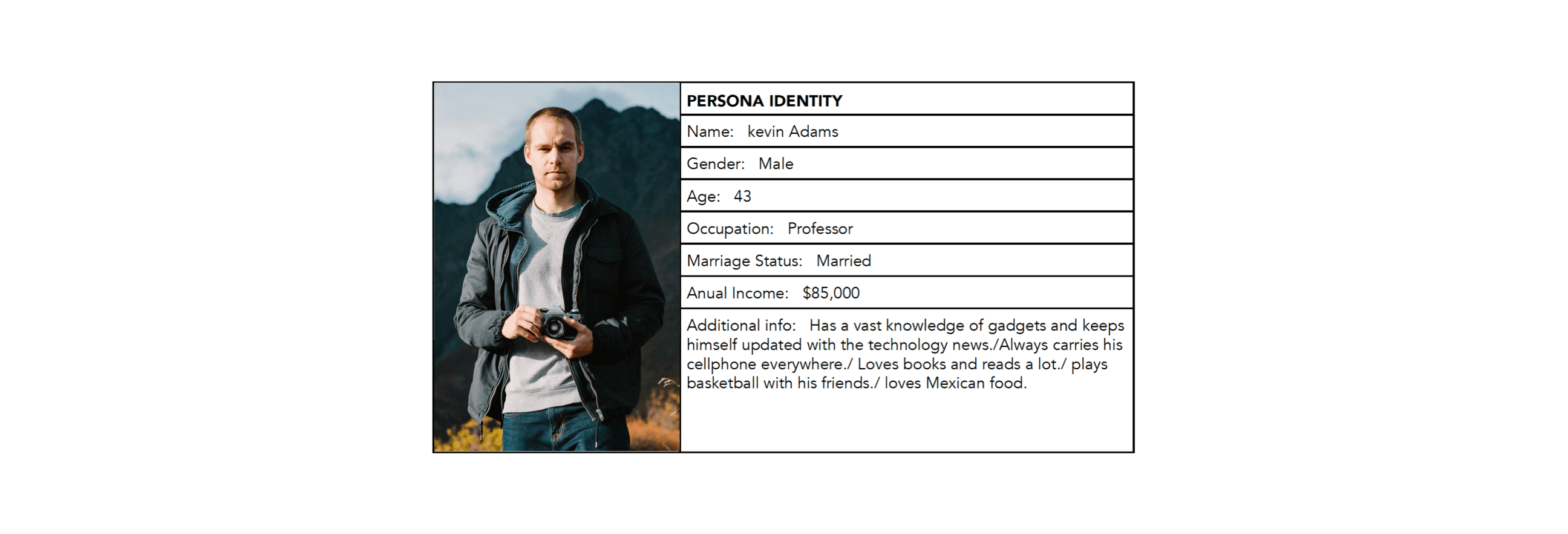
The target users for this application are 25-60 year-old male and female adults. The income level for this group is around $50,000 and in terms of educational level, they mainly hold bachelor degrees or have higher levels of education and working full-time. Psychographically, they are people who know how to use smartphones and tablets and spend more than 3 hours a day working on them and technology plays an important role in their lives. They can adapt technology to their daily tasks easily.
User Needs
The Target users needs are:
• having an easy access to each section of the application quickly
• a safe and secured environment
• communicating with other users
• providing a beautiful look and feel
• having an organized interface
• tracking their own activities and progress as well as their friends’
• A nice interface, encouraging the user to return to the application again.
• ease of navigating the interface
• being able to change the settings and to customize the trainings
Useful
This application is useful for regular exercises for people who want to be in shape as well as professional athletes who need a perfect training program. “Fitnessity” can provide everything that users need to have; a healthy workout without going to the gym. Moreover, the social media inside the application is very useful to be a motivation.
Usable
This application is easy to use because the interface design is well-organized and is bold and that has made the application simple for any user.
Desirable
The application’s image, identity, brand, and other design elements are designed according to the newest design styles and it evokes emotions and encourage the users to get engaged with the application and enjoy its visual approach.
Accessible
This application is not suitable for individuals with disabilities.
Findable
The content of this application is navigable and locatable onsite and offsite. Each part of the content has its own icon and name and it is easy to find.
Credible
“Fitnessity is a credible application. The social media in the app helps to maintain the credibility. Users can also register with their facebook account, so the application must be credible to cooperate with facebook.
Valuable
The application is valuable as it contains all factors of user experience. “Fitnessity” is useful, usable, desirable, findable, and credible. It fulfills the users’ needs in spite of its simplicity.
Information Architecture
The Approach
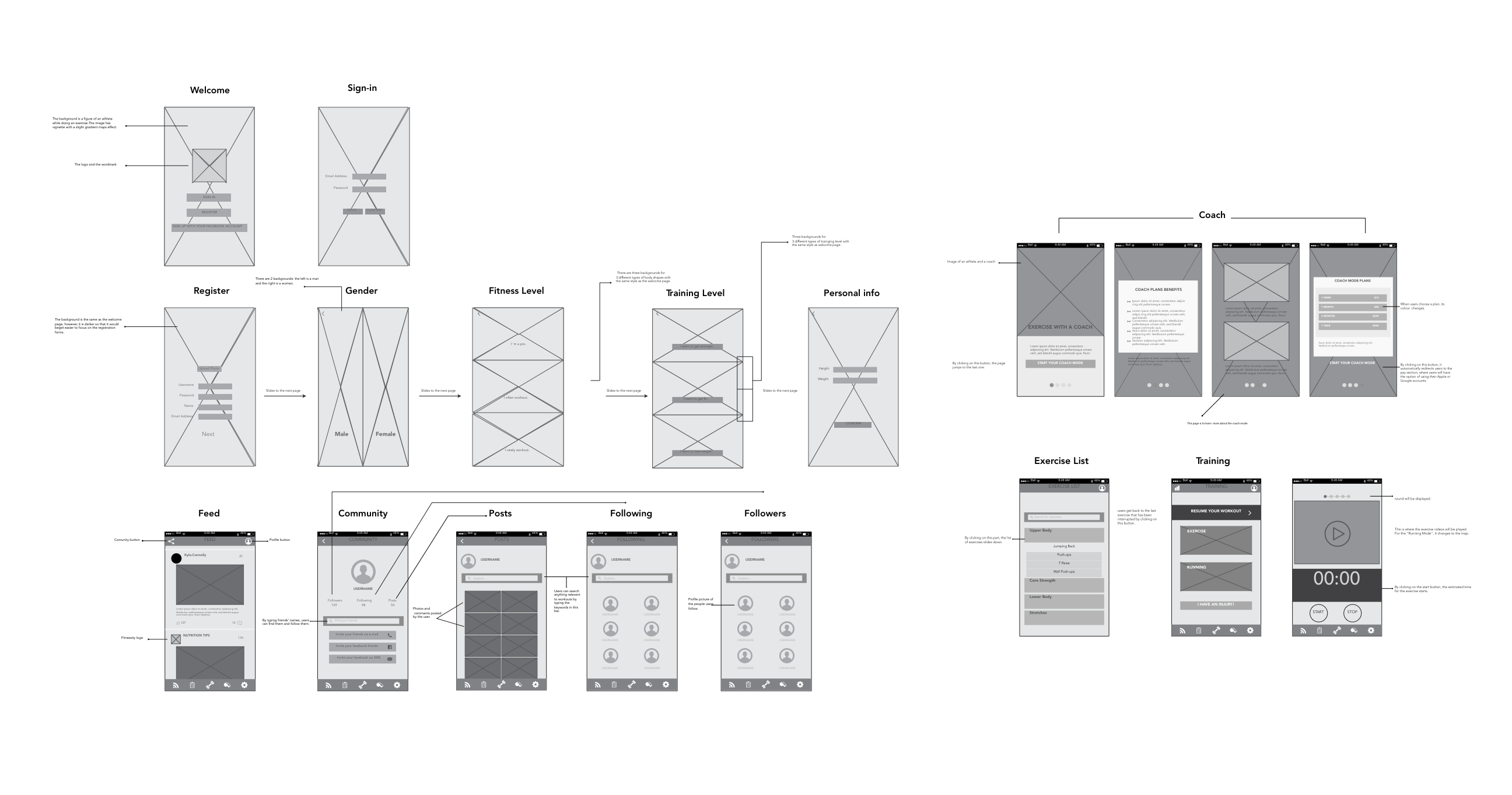
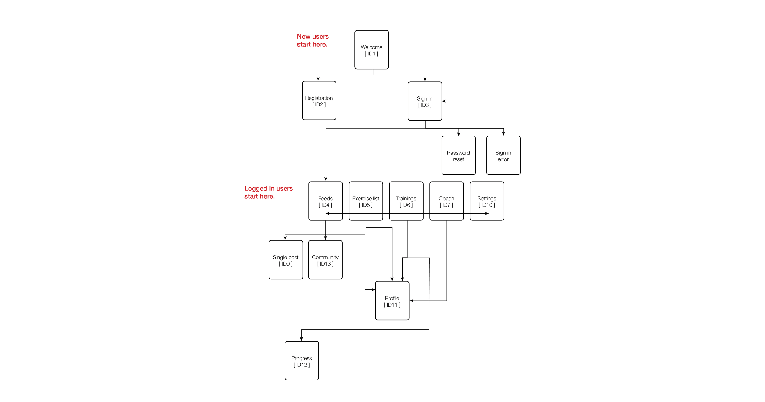
For the information architecture we have utilized a top-down approach in which there is a central structure which branches into its respective elements. The main element of “fitnessity” is the navigation bar with five different parts in which other sections of the application can be accessed.
The Logic
The logic behind this application is to give users the opportunity to get the best result from their workout in the most efficient way and easily.
Cognitive
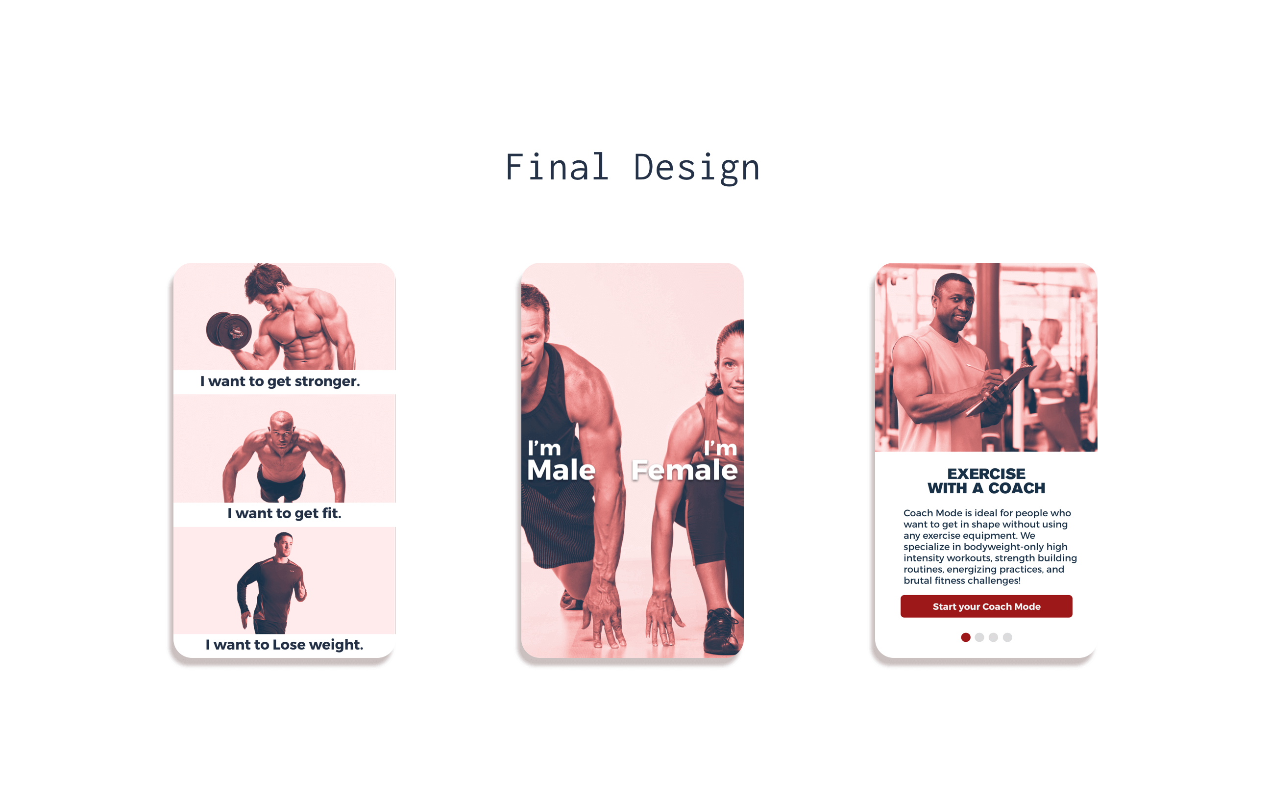
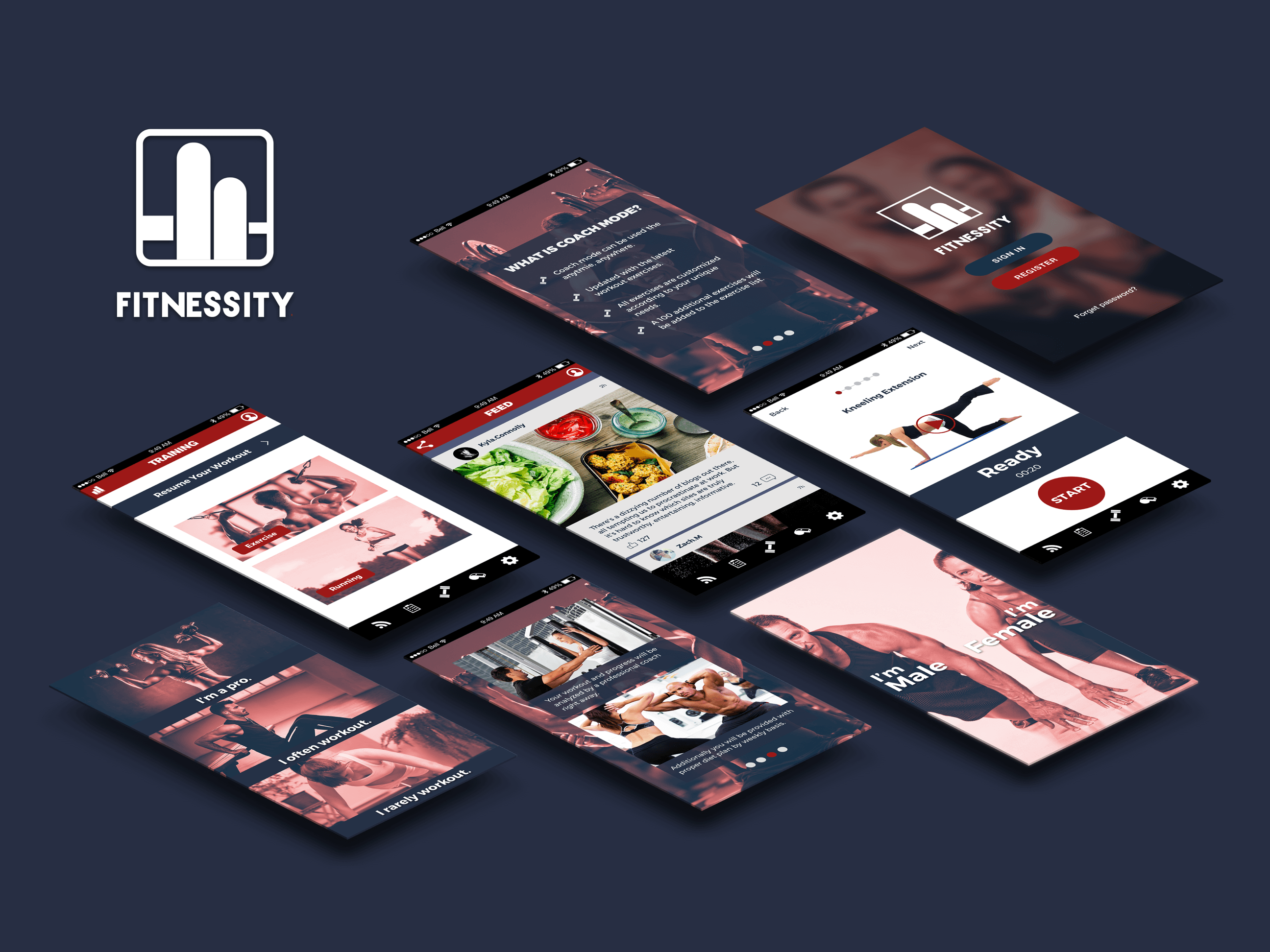
Although the colour palette used in “Fitnessity” is limited, it showcases a great contrast and gives the application a dynamic feeling along with demonstrating a sense of strength and moving forward. The colour palette is suitable for all target users, for both men and women. The red colour stimulate a sense of dynamism, while blue gives the user a feeling of confidence and makes the user trust in the application. The shapes used in this application are designed as simple to get the users straight to the point. The shapes are bold and in one colour because of the design strategy and make the application easy to navigate.
Navigation
The type of navigation that we have utilized in the “Fitnessiny” application is a mixture of global navigation and local navigation. The navigation used in this application is in a way that the user can easily access any part of the application. This varies according to where users are navigating in the app. Users sometimes need to have access to upper stages while navigating in lower stages or vice versa. In this case, users have broad access to various sections of the app through the navigation bar.
Interface Design
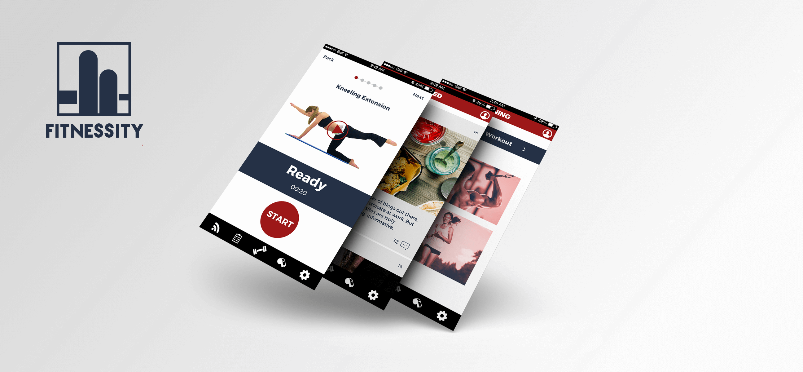
“Fitnessity” is designed based on having quick access to every part the users need to see and simplicity is a key in this application. The elements of the application look quite clean and the contrast between them helps the user to spot each section easily. The typography has a main role to make the contrast, since it is big and bold and facilitates the readability for the user. In addition, the contrast between two main colours of the application - blue and red- makes the layout look vibrant and dynamic, thus it becomes delightful for the user to navigate and get more out of the application. These all lead to unity in the interface design and the user can find the functionality of each colour, the types are easy to use, and after all, they can have a better understanding of the application. The platform of this application is Apple iPhone. There are few platform elements integrated in the interface design, such as Apple Maps, which collaborates in the running section and Force Touch technology for the “Fitnessity” icon, that can run the training or running section immediately.
