FitMyLife
Health and Fitness
Mobile App
Overview
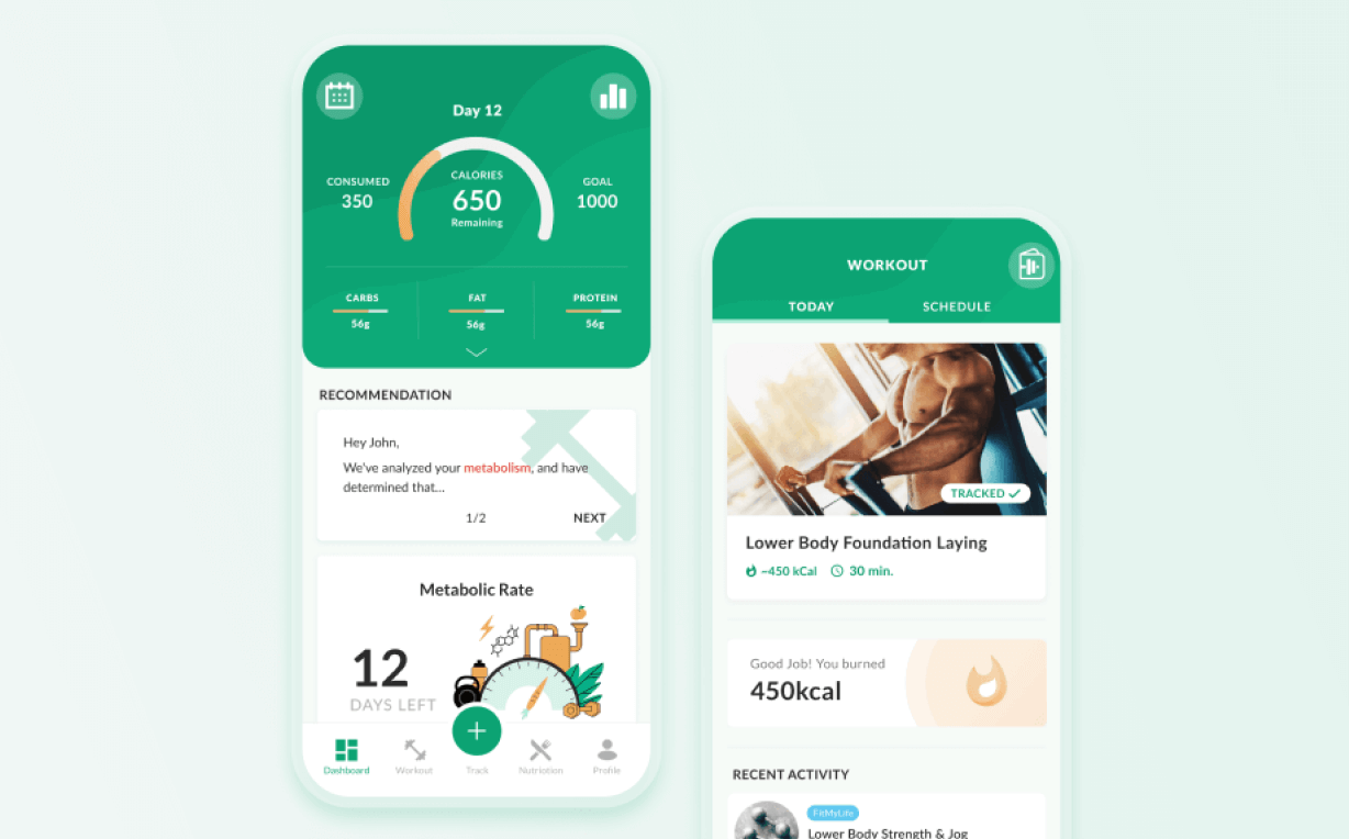
I’ve been the product designer at FitMyLife, a cutting-edge mobile app specialized in applying in-depth metabolic and nutritional science to help users reach their fitness goals. It is also capable of learning and adapting users’ behaviour and body compositions to create a personalized fitness and meal plan with the purpose of an optimal result.
My Role
I was solely responsible for User experience and user Interface Design and led all the design process, conducting various rounds of qualitative and quantitative research and creating sketches, wireframes, mockups, and prototypes, while collaborating closely with the developers to ensure the quality of implementation.

Challenge
FitMyLife app had a clouded user flow, various usability issues along with an outdated user interface. Plus, since a set of development frameworks with a considerable number of constraints was initially used, I had to manage the design process very carefully to reach proper implementation.
The Approach
The process is a combination of Lean UX and Design Thinking. This approach is an ongoing iteration-dependent process that is built upon measurable goals with research as the main focus.
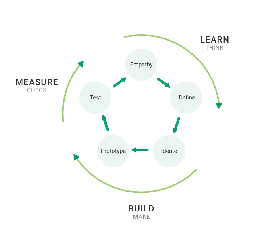
LEARN
THINK
Competitive Analysis
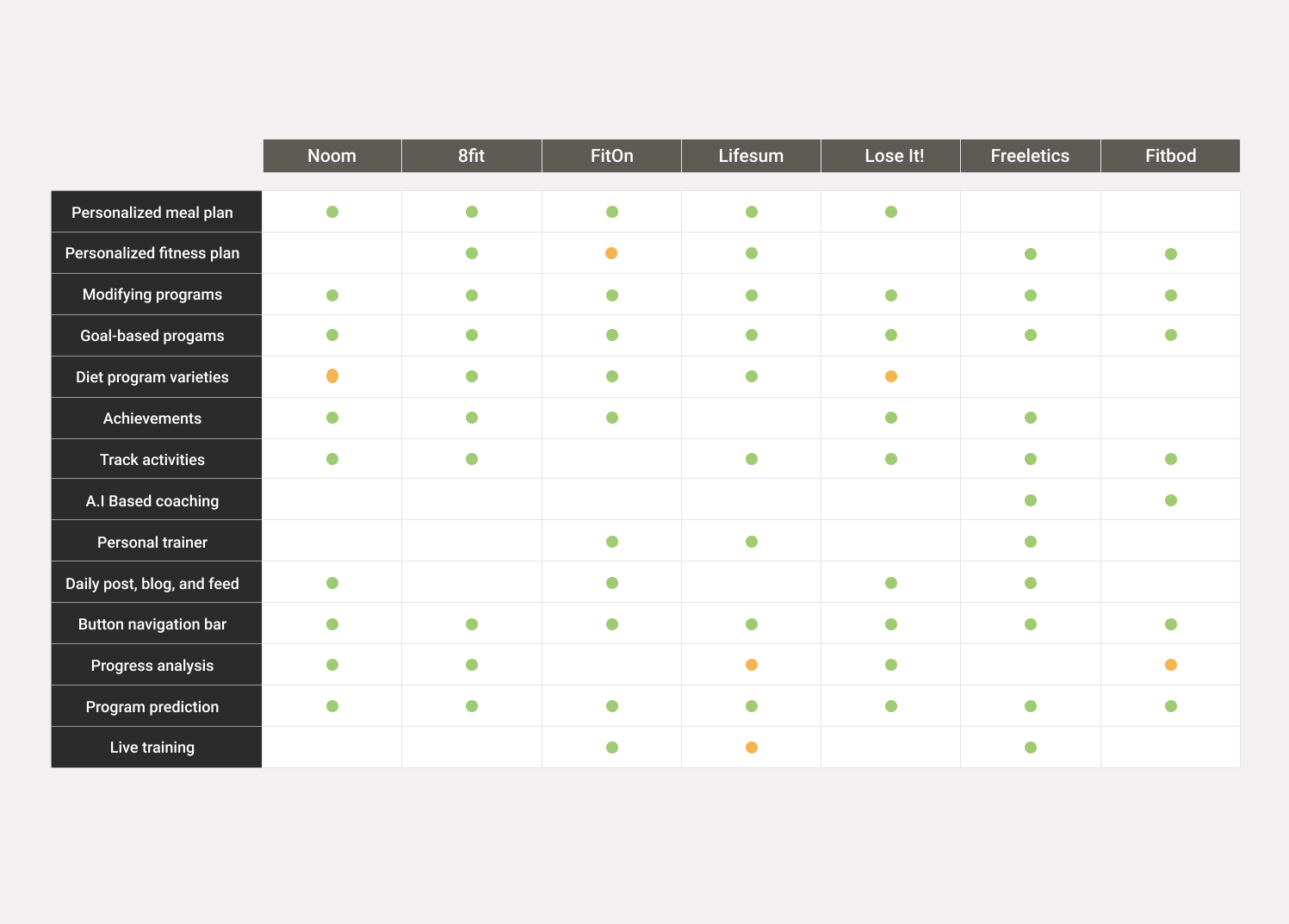
I conducted a Competitive Analysis to identify the competitors strengths and weak points. The analysis was done in 2 stages; first on the competitors which share similar features and functionalities, second on those less similar but with features that can potentially be added to the app.
In order to access all the premium features of these apps, we subscribed to them since the basic versions offer only limited features.
Analytics Review
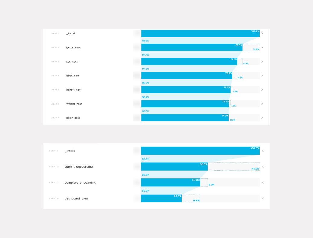
I performed a historical data analysis on the existing FitMyLife app which had been around for almost a year. We used Kochava, a platform for mobile attributions and analytics. Looking at product funnel, we spotted the user experience issues and at what point the users drop off.
Stakeholder Workshop
We set up a workshop with stakeholders to define the app goals along with business and user objectives. Through the workshop we were able to gain a thorough understanding of user needs and possible case scenarios for user experience.
Here we fleshed out the iteration outline and established a roadmap according to the ongoing business and performance analysis.
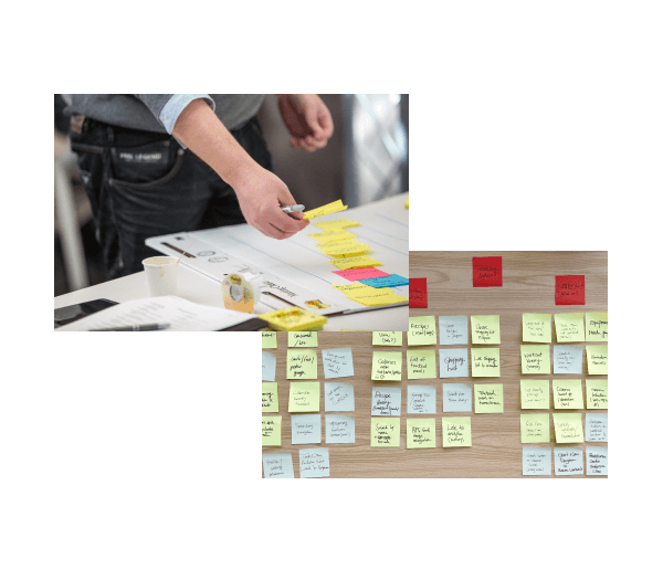
Using post-it notes and rough sketches, we generated various ideas to identify target audience and their pain points. We were then able to create Personas and User Journey Map, two very helpful documents that are used to develop the Information Architecture and the app interaction.
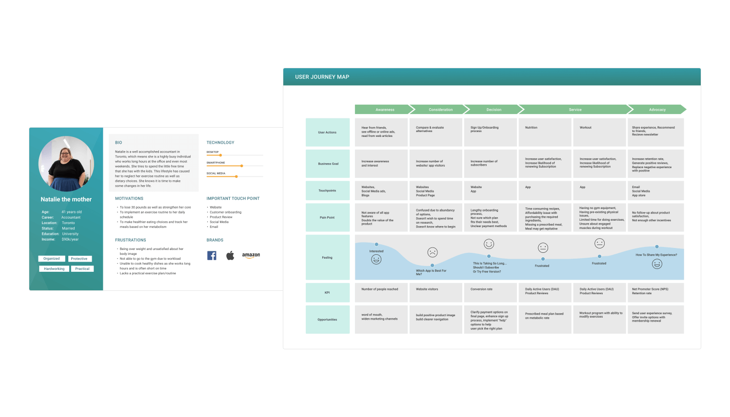
We also set a list of Key Performance indicators (KPI) to measure the value of the effectiveness of the new design.
Rainbow Spreadsheet
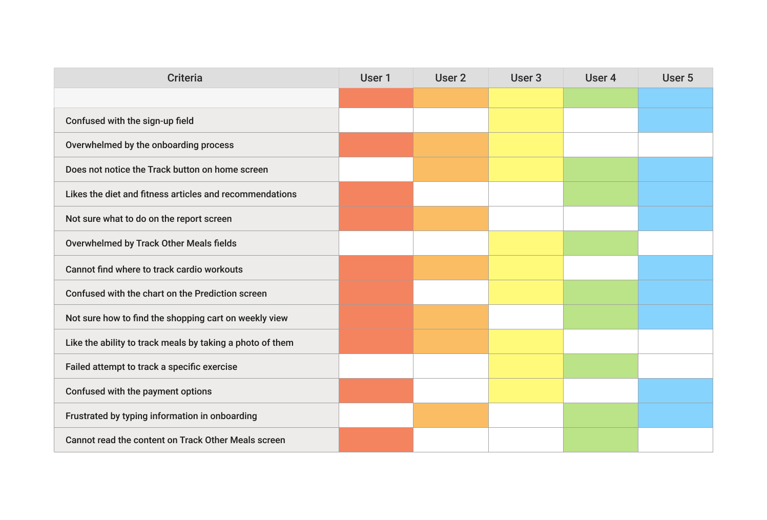
An initial usability testing was performed with 5 participants in order to highlight the current usability flaws. In order to translate the collected data into the quantitative data I built a rainbow spreadsheet in which I recorded behavioural patterns presented by research participants.
UX Audit
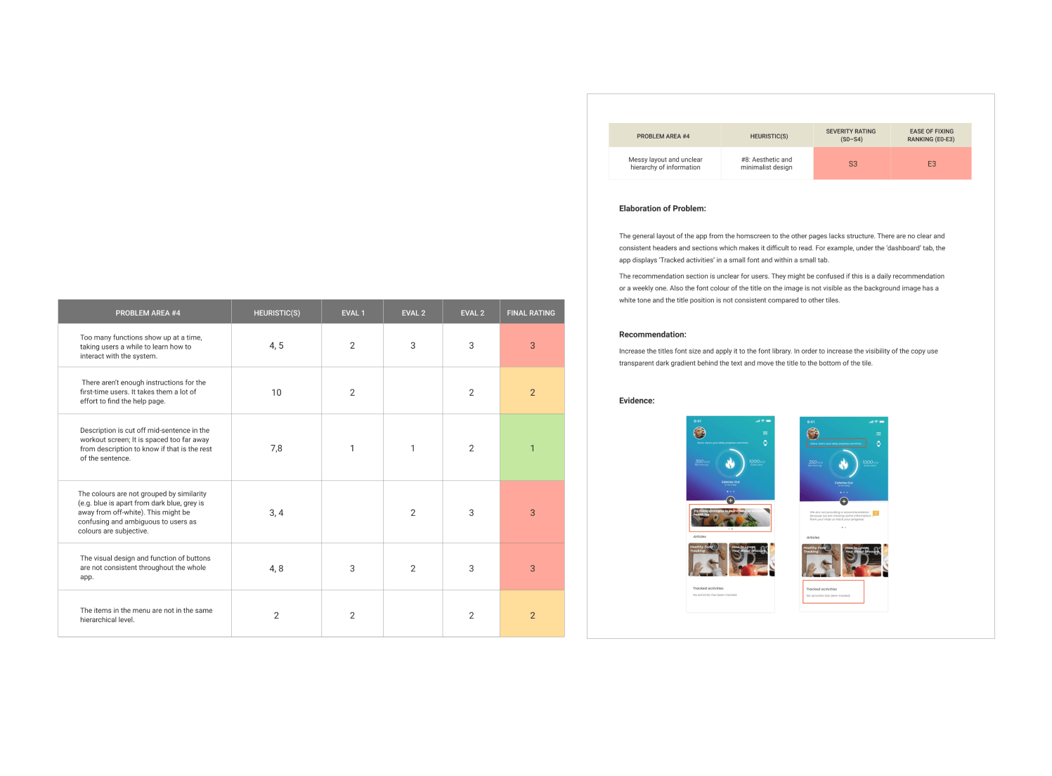
I performed a Heuristic Evaluation to pinpoint the usability issues. To do so, I followed Nielson Norman Group “10 Usability Heuristics” and collaborated with 3 other UX design experts as evaluators, examining its compliance with recognized usability principles.
The evaluation involves 10 Usability heuristics:
1. Visibility of system status
2. Match between system and the real world
3. User control and freedom
4. Consistency and standards
5. Error prevention
6. Recognition rather than recall
7. Flexibility and efficiency of use
8. Aesthetic and minimalist design
9. Help users recognize, diagnose, and recover from errors
10. Help and documentation
BUILD
MAKE
Exploring and Ideating
I started doing rapid sketch iterations, using data from the research stage and came up with several potential solutions. Using feedback from other stakeholders such as the nutritionist, trainer and data analyst, I did some initial validations on the sketches and was able to narrow down the ideas.
Wireframes
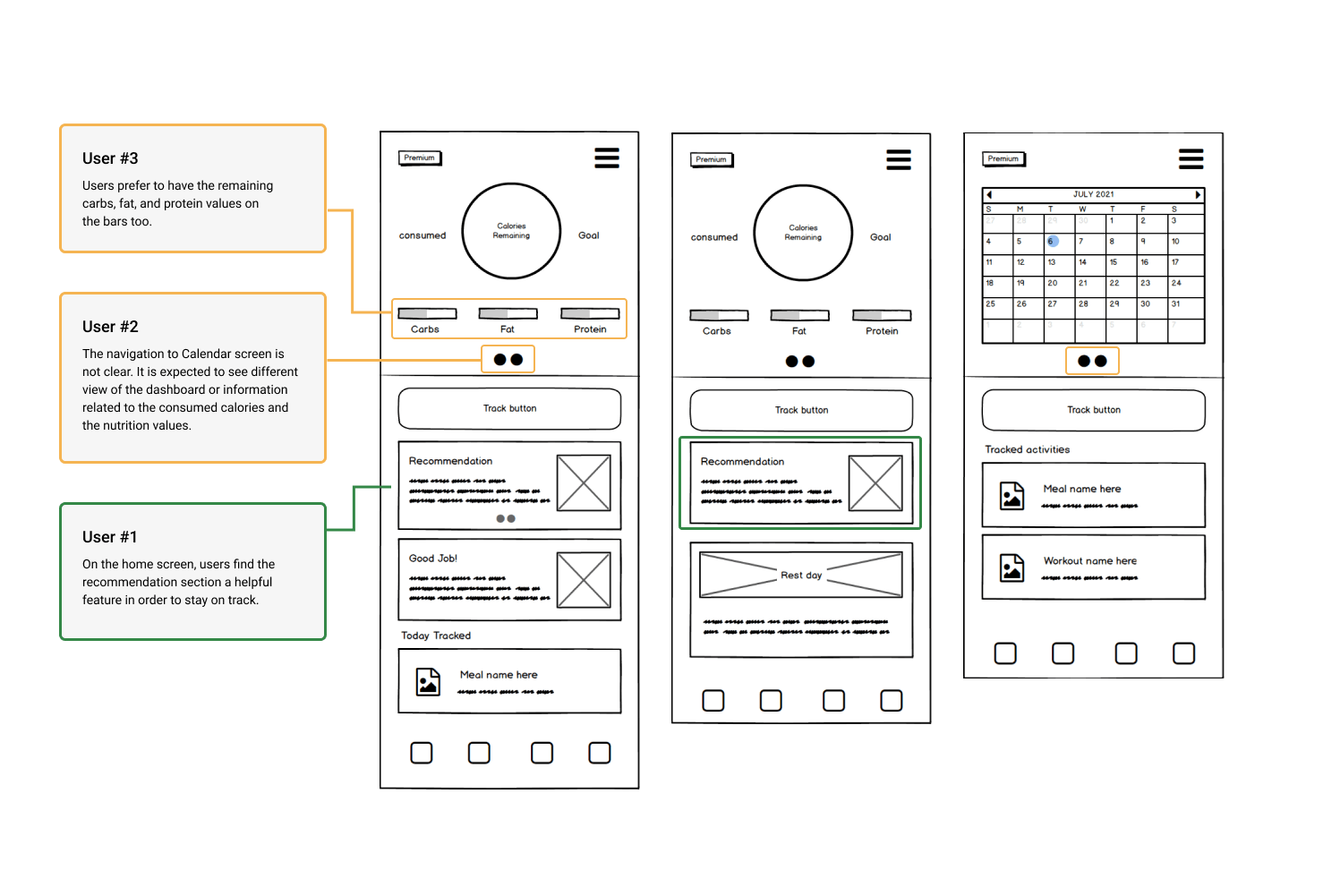
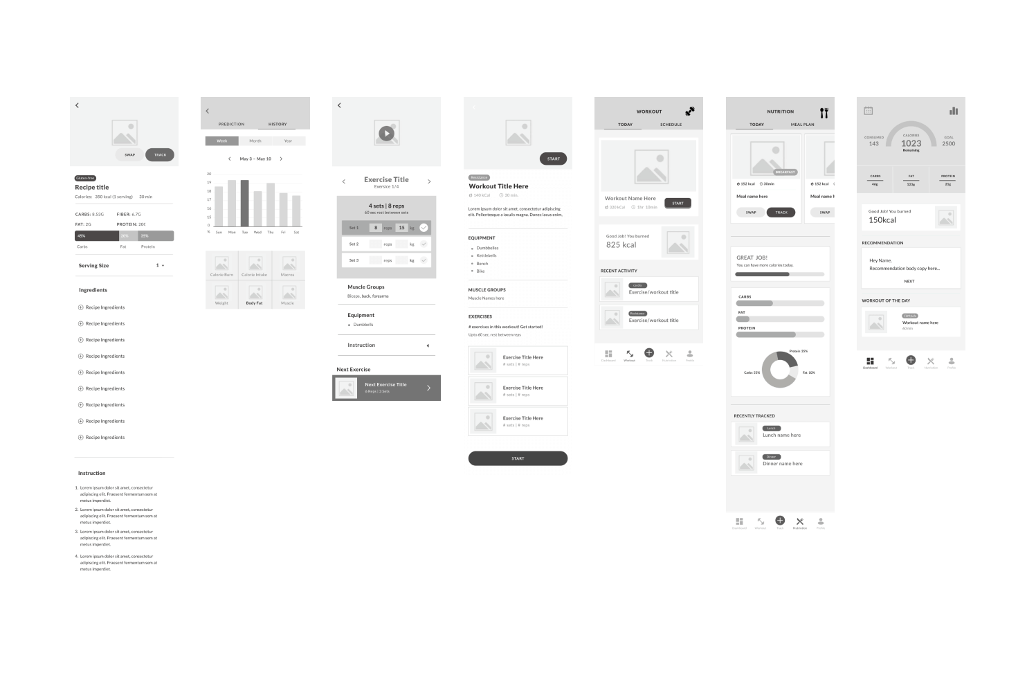
I created the structure and hierarchy of the design by wireframing the high impact screens, having the user’s needs in mind. These wireframes help demonstrate functionality and usability. They were used to a) explain to developers how the app works and identify the development limits, b) run user testing on 3 participants to receive feedback and validate the final concept.
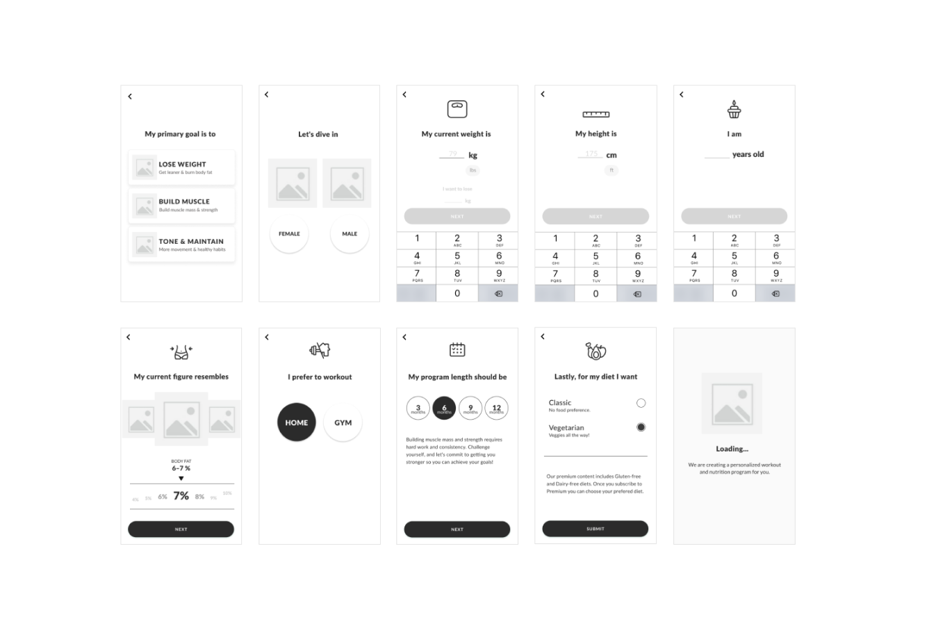
Onboarding
The user flow for on-boarding was created to show the process which users will follow to sign up to the app and subscribe for the premium version.

The key design challenge here was to build a step-by-step process that included the right order of the screens and was desirable for users so that they can understand and answer all the questions quickly.
Mockups
Once we made several changes to the navigation and optimized the information architecture of the overall app, I was able to produce low and high-fidelity mockups using the wireframes elements. These were used to create prototypes that were utilized to perform iterative rounds of quantitative and qualitative user testing.
Prototypes
As prototypes are powerful tools to envision the user flow and interactions, I used “invision” to create low and high-fidelity prototypes. I worked with the developers throughout the process to ensure the quality of the implementation.

MEASURE
CHECK
Usability Testing
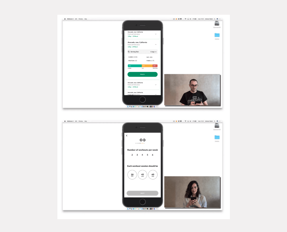
Both in-site and moderated usability testing was conducted so as to validate the iteration and to discover possible improvements in the app, further to help find out if users are having trouble interacting with the new features. This could guarantee the discoverability of information and ease of use.
KPI Performance
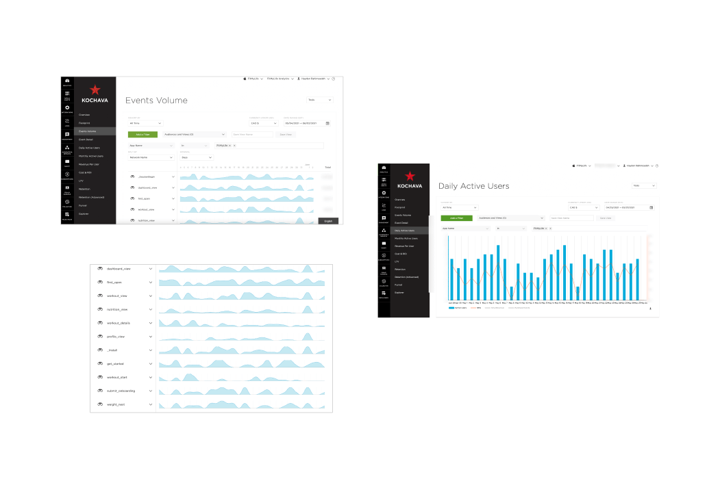
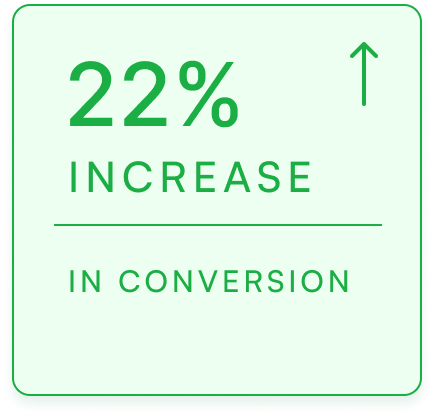
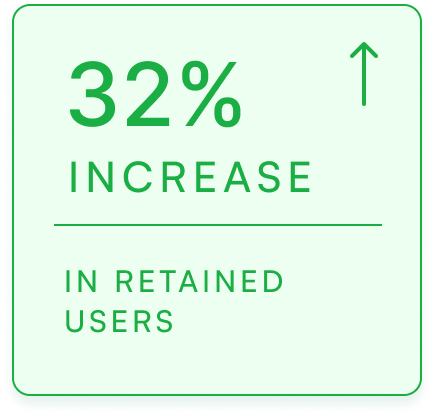
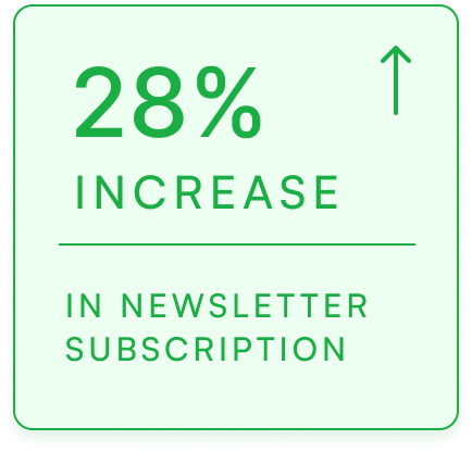
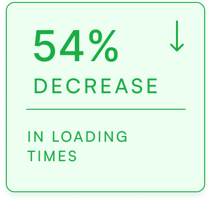
A set of Key Performance Indicators was selected to measure how much of the design and business objectives are achieved. After the initial release, we monitored and analyzed various performance factors such as CTR (Click Through Rate), CVR (Conversion Rate), Success Rate, Daily Active Users (DAU), etc. using Kochava by which we were able to understand the user behaviour and whether there are any alterations required to improve the experience.
Impacts
What's Next?
We establish a new iteration by pinpointing the usability issues derived from our analysis and collected data and prioritizing them based on the severity and impact. This also requires conducting further user research and having key stakeholders and decision makers on the same track.
FINAL DESIGN

